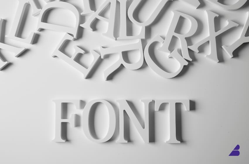
Typography is one of the most overlooked yet powerful elements of branding. The right font can shape how people perceive your business, influence emotions, and even impact buying decisions.
In this article, we’ll explore why typography matters in branding, how to choose the right font, and what trends are dominating in 2026.
1. Why Typography Matters in Branding
Fonts are more than just letters—they communicate personality, trust, and emotion. The typeface you choose can determine whether your brand feels bold and confident, modern and innovative, or classic and trustworthy.
🔹 First Impressions Matter – Customers form an opinion about your brand within seconds, and typography plays a big role in that perception.
🔹 Brand Recognition – Just like colors and logos, typography helps build brand consistency and recognition.
🔹 Readability & Accessibility – A well-chosen font ensures clear communication across all platforms, from websites to product packaging.
💡 Example: The iconic Coca-Cola script conveys heritage and nostalgia, while the sleek typography of Tesla reflects futurism and innovation.
2. The Different Types of Fonts & Their Meanings
Each font style triggers a different emotional response. Here’s a breakdown of the main typography categories and when to use them:
1. Serif Fonts: Traditional & Trustworthy
Serif fonts have small decorative strokes at the ends of letters, making them feel classic and reliable.
✅ Best for: Luxury brands, newspapers, law firms, finance companies
✅ Example: Times New Roman, Garamond, Baskerville
💡 Brand using it: Tiffany & Co. uses a serif font to emphasize elegance and sophistication.
2. Sans-Serif Fonts: Modern & Minimalist
Sans-serif fonts lack decorative strokes, making them look clean, modern, and approachable.
✅ Best for: Tech startups, modern brands, lifestyle companies
✅ Example: Helvetica, Arial, Futura
💡 Brand using it: Google switched to a sans-serif font for a simpler, more digital-friendly look.
3. Script Fonts: Elegant & Personal
Script fonts mimic handwriting, adding a touch of creativity, elegance, or playfulness.
✅ Best for: Boutiques, beauty brands, personal brands
✅ Example: Lobster, Pacifico, Allura
💡 Brand using it: Coca-Cola’s script font conveys heritage and friendliness.
4. Display Fonts: Bold & Unique
Display fonts are highly stylized and often used for logos or headlines. They help brands stand out.
✅ Best for: Entertainment brands, creative agencies, fashion brands
✅ Example: Impact, Bebas Neue, Anton
💡 Brand using it: Disney’s playful, custom display font reinforces its whimsical brand identity.
3. How to Choose the Right Font for Your Brand
Choosing a font isn’t just about what looks good—it’s about what aligns with your brand personality and audience.
🔹 Step 1: Define Your Brand Personality
Ask yourself: Is your brand modern or traditional? Playful or serious? Luxurious or affordable?
💡 Example: A financial advisory firm needs a trustworthy serif, while a streetwear brand may opt for a bold display font.
🔹 Step 2: Prioritize Readability
Your font should be clear and easy to read across all platforms—web, mobile, print, and signage.
💡 Avoid: Overly decorative fonts for body text, as they can be difficult to read in small sizes.
🔹 Step 3: Consider Font Pairing
Using two complementary fonts creates visual interest while maintaining balance.
✅ Best combinations:
- Serif + Sans-serif (e.g., Times New Roman for headings, Helvetica for body text)
- Script + Sans-serif (e.g., Playful script for a logo, clean sans-serif for website text)
🔹 Step 4: Test Across Platforms
A font may look great on a website but fail on mobile or packaging. Always test before finalizing.
4. Typography Trends in 2026
🔹 1. Geometric Sans-Serifs – Clean, modern, and perfect for digital branding (e.g., Montserrat, Poppins).
🔹 2. Bold, Oversized Typography – Making statements with large, impactful fonts.
🔹 3. Retro & Vintage Fonts – Nostalgia-driven branding is making a comeback.
🔹 4. Handwritten & Organic Fonts – Brands are using custom lettering for a personal touch.
💡 Example: Spotify uses bold typography in its campaigns to create high-impact messaging.
5. Typography Mistakes to Avoid
🚫 Using Too Many Fonts – Stick to 1-2 complementary fonts to maintain consistency.
🚫 Ignoring Readability – Fancy fonts that are hard to read can drive customers away.
🚫 Not Scaling for Different Devices – Your font should be legible on both desktop and mobile.
Final Thoughts
Typography is a powerful branding tool that shapes how your audience perceives your business. Choosing the right font can increase brand recognition, improve user experience, and make a lasting impact.
Whether you’re designing a new logo, launching a website, or creating packaging, your typography choices matter.
Are you using the right fonts for your brand? 🤔