How Alignment Subconsciously Shapes Trust in Social Posts
When people scroll through social media, they rarely stop to analyze a post. Yet, within a fraction of a second, they decide whether that post feels worth engaging with. That decision is often driven by something they cannot consciously name… that something is ‘alignment’.
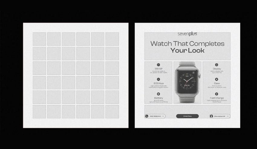
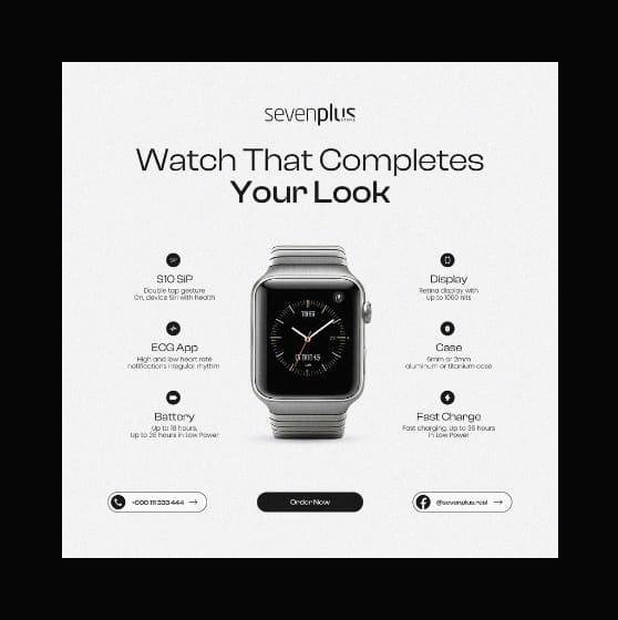
Professional designers also call it The Invisible Grid, which is the structure that places and holds content together. When done well this grid is rarely noticable, but you will realise it immediately when this grid is done poorly. And over time, it has become one of the strongest subconscious signals of trust in social posts.
Alignment as a Visual Anchor
Why the Eye Trusts Order
Alignment does more than make a post ‘look neat and clean.’ It gives the audiences’ eye a place to rest and a path to follow.
What happens subconsciously?
When elements (such as text blocks, icons, images, CTAs) align, the brain immediately understands where to look first, second, and last. This reduces uncertainty, and reduced uncertainty is interpreted as Clarity. It provides the reader with Perseverance i.e. the desire to continue with engagement.
Jessica Walsh, co-founder of the creative agency &Walsh, known globally for emotionally resonant brand campaigns and bold digital visuals, has spoken about this effect in social content audits. She notes that audiences often describe aligned posts as ‘clear’ or ‘honest’, even when the message itself is unchanged.
That reaction isn’t emotional. It’s neurological.
Research in design psychology finds that aligned layouts reduce visual noise and cognitive friction which make up the mental effort required to process information. When elements line up neatly, users don’t have to work to interpret the content, which fosters cognitive ease … a psychological state strongly associated with perseverance and credibility.
The lesser-known detail
Alignment acts as a proxy for effort.
In simple terms: when something looks orderly, our brains assume it’s possibly ‘worthwhile’. Misaligned or chaotic visuals increase subconscious ‘doubt signals’ because the eye constantly recalibrates where to move next.
Alignment gives subtle signals of purposefulness. On platforms flooded with hurried, templated or cluttered content, misalignment creates micro-friction which are tiny moments where the eye cannot rest. With more such moments, the intension to stay on the post reduces.
Visual Heuristics
Perseverance Is Decided Before Reading Begins
Heuristics are mental subconscious shortcuts or sort of a ‘rules of thumb’ that people mostly use to make fast and efficient decisions to a solve non-critical problem or has incomplete information.
People do not read social posts first. They use their visual heuristics and scan patterns. Human perception is incredibly fast. Within milliseconds of seeing a post, the human brain has already made initial judgments about it.
In social feeds, alignment, symmetry, and spacing are among the strongest heuristics tied to credibility.
Symmetry and contrast aren’t just aesthetic choices. Empirical research shows that posts with balanced symmetry and clear contrast elicit higher engagement and liking, which often translates into perceived trustworthiness.
Rather than logical analysis, this judgment occurs at the perceptual level i.e. before conscious reasoning kicks in. That’s why even simple design improvements can significantly impact how persevable a post feels.
Mike Kus, a well-known designer and photographer best known for shaping early Instagram visual culture through his minimalist, grid-aware compositions, has shared that during brand collaborations, posts that preserved strong internal alignment consistently outperformed visually ‘loud’ designs, even when the latter used brighter colors or bolder headlines.
Subtle but powerful insight
Perfect symmetry is not required — predictable alignment is.
Even asymmetrical designs feel trustworthy if:
- margins are consistent
- text blocks snap to an invisible column
- images relate proportionally to typography
When alignment is predictable, the brain relaxes. And when the brain relaxes, it becomes more receptive.
This explains that the posts with simple, structured layouts often outperform complex ones — because they are mentally economical.
Symbolic Alignment
When Design Feels Like It Belongs
Beyond layout, symbolic alignment also plays a role. A recent study of Instagram posts found that including combinations of social, cultural, and political symbols can enhance perceived trust, especially when these symbols resonate with the audience’s context.
For instance, a social post that integrates social cues familiar to a specific group (e.g. shared cultural motifs or shared political icons) doesn’t just communicate visually but it also signals belonging. This unconscious grouping effect increases engageable-ity because individuals tend to favor content that looks like it fits their worldview or community norms.
This goes beyond mere ornamentation. It shows that meaningful alignment of visual cues with audience context can amplify perseverance.

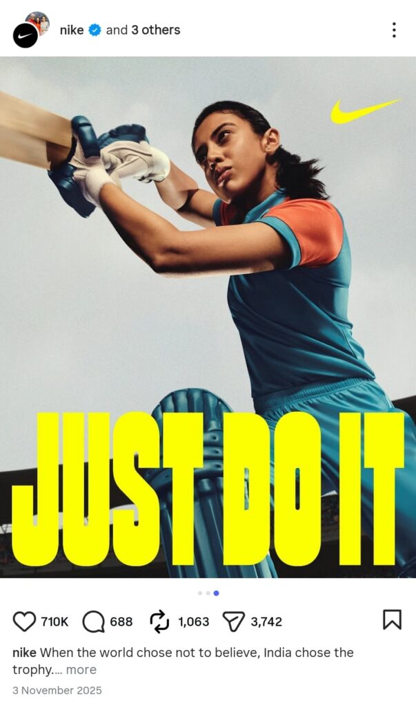

Debbie Millman, brand strategist, host of the “Design Matters” podcast, and former president of the AIGA, often emphasizes that trust and perseverance grows when design feels familiar without being generic.
In social media terms, this means:
- A fintech brand using restrained grids and muted palettes
- A youth brand embracing looser alignment but consistent rhythm
- A luxury brand maintaining strict typographic and spacing discipline
The overlooked risk
Designers sometimes chase novelty and ‘out-of-the-box’ at the cost of symbolic alignment. When visuals clash with category norms, audiences don’t think ‘this is innovative’ … they simply think ‘something is off!’
Source and Argument Cues Interact with Design
Alignment also interacts with other known trust cues — like credibility of the source and argument quality. Research from social media studies emphasizes that users don’t evaluate trust based on isolated features. Instead, they process a blend of signals, including:
- Popularity metrics (likes, shares),
- Argument strength (the quality of message content),
- Visual clarity and structure.
Studies indicate that people use cue utilization to reduce uncertainty online. They interpret post features (like design coherence) as cues that stand in for quality or reliability when direct information is limited.
Thus, a well-aligned post effectively leverages design as a credibility cue — especially under low user involvement, when audiences rely more on heuristics than deep analysis.
Luke Wroblewski, a product designer known for pioneering mobile-first design principles and former Google design lead, has highlighted that users rely on combined cues when making snap judgments. In social posts, these cues include:
- message clarity
- source familiarity
- visual order
A lesser-discussed insight
When users are distracted (which is almost always on social media) layout quality substitutes for content evaluation.
In other words:
People perceive aligned posts before they decide whether the argument itself is sound.
This explains why misinformation often spreads faster when packaged in clean, aligned visuals. The design earns trust faster than logic can catch up.
Subconscious Psychology Behind 'The Invisible Grid'
Why does alignment work so deeply on perseverance?
a. Cognitive Load Theory
When posts are visually ordered, they reduce cognitive load — the mental strain of interpreting complex or disjointed information. This ease feels good, and humans equate “ease” with truthful or reliable content.
b. Familiarity Bias
People prefer familiar structures. The brain equates familiar patterns with safety and predictability, which are important trust signals in social environments.
c. Peripheral Processing
Persuasion models like the Elaboration Likelihood Model (ELM) show that when people are not intensely focused on content, they rely on peripheral cues such as layout, font, and spatial harmony to form opinions.
Alignment becomes one such cue, especially when the audience skims rather than deeply engages.
Practical Implications for Creators and Marketers
The Invisible Grid isn’t a secret algorithm
The Invisible Grid is human psychology mapped into visual form. Here’s how this understanding can be applied:
- Design for consistency: Use coherent alignment patterns across posts and platforms. Consistency breeds recognition, which supports trust.
- Balance aesthetics with clarity: Symmetry and clear visual hierarchy help audiences process content quickly and without effort.
- Use symbolic alignment thoughtfully: Integrate familiar and culturally relevant symbols with care, but not so heavily that they become distracting.
- Optimize peripheral cues: Even if a post’s argument is strong, its credibility can be undermined if the visual structure feels chaotic.
Prominent social media designers repeatedly return to the same idea: good alignment disappears.
When alignment works:
- nothing feels forced
- nothing competes unnecessarily
- the message flows naturally
In conclusion, PERSEVERANCE in social posts isn’t a function of words alone. It’s a visual architecture … an invisible grid that our brains read, interpret, and judge long before we consciously reflect on the message. Understanding and intentionally shaping that grid differentiates content that feels trustworthy from content that’s merely seen.
The Invisible Grid is not about rigid rules. It is about predictability, rhythm, and respect for the viewer’s attention.
