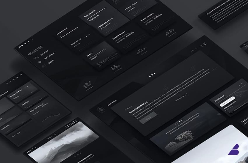
Dark mode has taken over the digital world. From smartphones and apps to websites and software interfaces, users now have the option to switch to sleek, eye-friendly dark themes. But beyond its aesthetic appeal, dark mode design plays a significant role in shaping brand perception.
Brands that embrace dark mode aren’t just following a trend—they’re signaling modernity, sophistication, and innovation. But does dark mode work for every brand? And how does it affect how consumers view your business? Let’s dive in.
1. The Psychology of Dark Mode
Dark mode isn’t just a design choice—it taps into deep psychological associations.
✔ Luxury & Exclusivity – Black is often linked to premium and high-end brands (think luxury cars, designer fashion, and tech gadgets).
✔ Mystery & Sophistication – A dark background creates a sleek, futuristic feel, making brands seem more cutting-edge.
✔ Focus & Minimalism – Dark interfaces reduce distractions, helping users focus on the content.
✔ Calm & Comfort – Less blue light at night makes dark mode easier on the eyes, enhancing user comfort.
💡 Example: Brands like Apple, Tesla, and Nike use dark-themed visuals to exude premium quality and innovation.
2. How Dark Mode Impacts Brand Identity
A. Tech & Innovation Brands: A Bold, Futuristic Look
Tech companies thrive on cutting-edge innovation—and dark mode reinforces that identity.
✔ Feels modern and forward-thinking
✔ Enhances UI contrast for a premium look
✔ Attracts younger, tech-savvy audiences
💡 Example: Spotify and Netflix use dark mode to create an immersive, high-contrast experience that makes content pop.
B. Luxury & Fashion Brands: Elevating Elegance
Dark backgrounds are associated with high-end branding. Luxury brands use them to convey exclusivity and sophistication.
✔ Enhances premium product visuals
✔ Creates a dramatic, high-impact effect
✔ Works well with metallic accents (gold, silver)
💡 Example: Gucci and Rolls-Royce use black and dark color schemes to reinforce their luxury status.
C. Health & Wellness Brands: The Challenge of Dark Mode
Wellness brands typically use light, airy colors to evoke cleanliness, purity, and positivity. Dark mode can sometimes feel too intense for these brands.
✔ May reduce a sense of warmth and approachability
✔ Better suited for nighttime meditation or fitness apps
💡 Example: Headspace and Calm, meditation apps, use dark mode options at night but keep their primary branding light and inviting.
D. Corporate & Finance Brands: Trust vs. Innovation
For industries like finance, banking, and law, trust is key. While dark mode can modernize a brand, it must balance professionalism and readability.
✔ Dark mode works well for fintech and crypto brands
✔ Traditional banks may struggle with dark UIs if not executed well
💡 Example: Robinhood and Binance use dark mode for a modern, high-tech feel, whereas Goldman Sachs sticks to a classic white background for credibility.
3. The UX Benefits of Dark Mode
Beyond branding, dark mode improves user experience in several ways:
✔ Reduces Eye Strain – Especially useful for late-night browsing.
✔ Improves Battery Life – OLED and AMOLED screens consume less power in dark mode.
✔ Enhances Contrast – Makes elements like buttons and text stand out.
💡 Pro Tip: If your brand uses dark mode, ensure text remains highly readable by using contrasting fonts and accent colors.
4. Should Your Brand Use Dark Mode?
While dark mode can elevate brand perception, it’s not for everyone. Ask yourself:
✅ Does my brand target tech-savvy or luxury-focused audiences?
✅ Do my products/services look better in high contrast?
✅ Is my website/app used at night or in low-light settings?
If you answered yes to most of these, dark mode could be a game-changer for your brand.
5. Best Practices for Implementing Dark Mode
If you decide to integrate dark mode into your brand’s design, follow these best practices:
✔ Use High-Contrast Colors – Dark gray works better than pure black, and text should have strong contrast.
✔ Allow Users to Toggle – Give visitors an option to switch between light and dark mode.
✔ Test Readability & Accessibility – Ensure fonts and UI elements remain legible.
✔ Keep Brand Identity Intact – Dark mode should still reflect your brand’s core visual style.
💡 Example: Instagram and Twitter allow users to switch between light and dark modes, catering to different user preferences.
Final Thoughts: The Future of Dark Mode Branding
Dark mode is no longer a passing trend—it’s a strategic design choice that affects brand perception, user experience, and engagement. Whether you’re a tech startup, luxury brand, or fintech company, implementing dark mode smartly can enhance your brand’s appeal.
If your brand isn’t using dark mode yet, 2025 might be the perfect time to experiment with it. 🚀
What Do You Think?
Would dark mode fit your brand’s identity? Share your thoughts below!