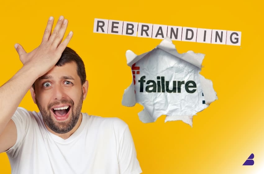
Rebranding can be a powerful strategy for businesses looking to modernize, reposition, or recover from negative perceptions. However, when done wrong, a rebrand can alienate loyal customers, confuse the market, and lead to massive financial losses.
Several major brands have made costly rebranding mistakes that serve as cautionary tales. In this article, we’ll break down some of the biggest rebranding failures, analyze what went wrong, and outline key takeaways to help businesses avoid the same fate.
🚨 1. The Gap Logo Disaster (2010)
What Went Wrong?
In 2010, Gap, the popular clothing retailer, suddenly replaced its iconic blue-box logo with a generic, uninspiring sans-serif design. The change was met with immediate backlash from customers who saw the old logo as a symbol of trust and nostalgia.
Within just six days, Gap was forced to revert to its original logo, losing millions in the process.
Lesson Learned:
✔ Never ignore customer loyalty. Sudden, drastic changes can alienate your audience.
✔ Test before launching. Gap could have conducted focus groups or A/B testing to gauge customer reactions.
✔ A brand refresh doesn’t mean total reinvention. Sometimes, minor tweaks are more effective than complete overhauls.
🚨 2. Tropicana’s Packaging Fail (2009)
What Went Wrong?
Tropicana decided to redesign its classic orange juice packaging, replacing the iconic orange-with-a-straw image with a minimalistic, generic design.
Customers no longer recognized the product on shelves, leading to a sales drop of $30 million within two months. The backlash forced Tropicana to revert to the original packaging.
Lesson Learned:
✔ Brand recognition is crucial. If customers don’t recognize your product instantly, sales will suffer.
✔ Packaging is part of brand identity. The original Tropicana design evoked freshness and quality—removing those visual cues hurt the brand.
✔ Change should feel evolutionary, not revolutionary. If customers are used to a certain design, subtle updates work better than drastic ones.
🚨 3. New Coke’s Catastrophe (1985)
What Went Wrong?
Coca-Cola, in an attempt to compete with Pepsi, changed its legendary formula and introduced “New Coke.” The backlash was instant—loyal customers were outraged that their favorite drink had been altered.
The result? Coca-Cola was forced to bring back the original formula under the name Coca-Cola Classic, proving that brand legacy and customer loyalty matter more than short-term innovation.
Lesson Learned:
✔ Don’t fix what isn’t broken. If customers love your product, a drastic change can do more harm than good.
✔ Brand heritage is valuable. Coca-Cola underestimated the emotional connection people had with its original formula.
✔ Customer feedback matters. Extensive testing before launch could have prevented the backlash.
🚨 4. Mastercard’s Pricey Logo Change (2006)
What Went Wrong?
Mastercard changed its famous interlocking red and yellow circles to a more abstract design. The result? Customers didn’t recognize the new logo, causing confusion.
Worse, Mastercard spent over $1.5 billion on marketing efforts to fix the branding disaster.
Lesson Learned:
✔ Simplicity works. The original design was instantly recognizable—complicating it made it forgettable.
✔ Brand association is powerful. When a logo is deeply ingrained in consumer memory, even small tweaks can cause confusion.
✔ Rebranding should have a clear purpose. Changing a logo just for the sake of modernization can backfire.
🚨 5. Uber’s Identity Crisis (2016)
What Went Wrong?
In 2016, Uber changed its bold, modern wordmark to an abstract geometric symbol that confused both customers and drivers. The lack of a clear connection between the new icon and the Uber brand made the redesign ineffective.
After heavy criticism, Uber reverted to a simpler, more recognizable wordmark in 2018.
Lesson Learned:
✔ Logos should be instantly recognizable. Customers shouldn’t have to guess what brand a symbol represents.
✔ Branding should align with company values. Uber’s tech-like symbol failed to represent its core service—transportation.
✔ Don’t change for the sake of change. If the original branding is strong, improvements should enhance, not confuse.
🚨 6. Pepsi’s Overcomplicated Logo Change (2008)
What Went Wrong?
Pepsi spent a staggering $1 million redesigning its logo, attempting to modernize the classic red, white, and blue globe.
However, the new logo looked too similar to previous versions, making the expensive redesign feel unnecessary. Worse, the internal design rationale for the new logo was overcomplicated and vague, referencing principles like the Fibonacci sequence and the Earth’s magnetic field—none of which connected with consumers.
Lesson Learned:
✔ Rebranding should have a clear, meaningful purpose. Overcomplicated reasoning doesn’t resonate with customers.
✔ If customers don’t see a difference, they won’t care. A redesign should add value, not just change for the sake of it.
✔ Keep branding simple and intuitive. If you need a 20-page document to explain a new logo, it’s too complex.
💡 Key Takeaways: How to Avoid Rebranding Failures
✅ Know Your Audience. Involve customers in the process through surveys, testing, or soft launches.
✅ Retain Brand Equity. Don’t throw away elements that make your brand recognizable.
✅ Rebrand with a Purpose. Ensure there’s a valid reason for the change—align it with business goals.
✅ Test Before Committing. Gather feedback before rolling out a full-scale redesign.
✅ Communicate the Change. If rebranding is necessary, explain why and ensure a smooth transition.
🚀 Final Thoughts: Rebranding Should Strengthen, Not Weaken, Your Brand
While a successful rebrand can elevate a business, a poorly executed one can damage credibility, confuse customers, and cost millions.
The key is to evolve strategically, respect brand heritage, and prioritize customer perception.
🔹 Thinking about rebranding your business? Make sure to test, plan, and execute it the right way!