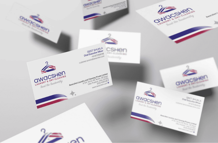
In brand discussions, the logo dominates the room. It is scrutinized, debated, revised, and defended. Yet just beneath it, often literally, sits a quieter element that does far more heavy lifting than it gets credit for: the secondary text. The tagline, descriptor, or supporting line below the logo is frequently treated as an afterthought. In practice, it can be the difference between a brand that feels deliberate and one that feels unfinished.
Seasoned graphic designers know this. Many have learned it the hard way through real client reactions, market feedback, and years of observing how people actually read and remember brands.
The First Line People Actually Read
Michael Bierut, partner at Pentagram, one of the world’s most influential design studios, is known for leading identity projects for brands such as Mastercard, Saks Fifth Avenue, and MIT. He has often spoken about how people rarely “see” logos the way designers intend. In real-world settings—signage, packaging, social feeds—viewers scan, not study. Bierut has remarked in lectures and essays that people read words before they admire marks.
The secondary text below a logo often becomes the first meaningful information a viewer processes. It tells the audience:
- What category the brand belongs to
- How formal or approachable it is
- Whether it is modern, heritage-driven, technical, or human
If the logo is the face, the secondary text is the voice.
Where Brand Clarity Is Won or Lost
Paula Scher, also a Pentagram partner and one of the most recognized figures in contemporary graphic design, is famous for her work with major cultural and corporate institutions including Citi, The Public Theater, and the Museum of Modern Art. She has frequently pointed out that many identity systems fail not because the logo is weak, but because everything around it lacks consistency.
In one corporate rebrand she has discussed publicly, the logo itself tested well, but customer confusion persisted. The issue was traced to inconsistent subtext: varying fonts, weights, and tonal treatments used beneath the logo across touchpoints. Once the secondary typography was standardized and aligned with the brand’s positioning, recognition improved without altering the logo at all.
This is a recurring pattern. Secondary text is where:
- Startups clarify what they actually do
- Legacy brands modernize without abandoning equity
- Premium brands justify their pricing through tone and restraint
A logo alone cannot do this work.
The Psychological Weight of Hierarchy
Erik Spiekermann, a renowned German typographer and type designer, is best known for founding the type foundry FontShop and for designing widely used typefaces such as FF Meta. He has long argued that typefaces carry cultural memory and emotional cues far beyond aesthetics.
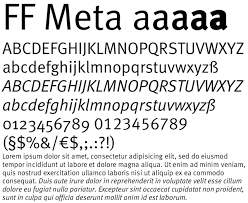
When a brand places a condensed grotesk under an elegant symbol, it signals efficiency and seriousness. When it uses a soft humanist sans or serif, it signals warmth and trust. These signals are absorbed instantly, often subconsciously.
Designers with extensive retail and wayfinding experience note a clear behavioral pattern: customers lean closer to read secondary text when deciding whether a product or service is “for them.” That moment of leaning in is where typography either reassures or repels.
When Secondary Text Carries the Brand Alone
Jessica Walsh, founder of &Walsh and formerly a partner at Sagmeister & Walsh, is known for expressive, concept-driven branding that performs strongly in digital environments. She has spoken about designing brands for fragmented attention, where identities are consumed in parts, not as complete systems.
In such environments i.e. social media avatars, mobile headers, favicons, the logo mark is often cropped or removed. What survives is the name and its supporting line. If the typography lacks clarity or character, the brand disappears into the scroll.
This is why experienced designers test secondary text independently:
- Does it still feel on-brand without the mark?
- Does it communicate value in one glance?
- Does it scale across formats without losing tone?
If the answer is no, the identity is fragile.’
Real Client Reactions Designers Don’t Forget
Ask any senior designer about client feedback, and you will hear variations of the same refrain:
- “Can we make the tagline bigger?”
- “People don’t understand what we do yet.”
- “The logo looks fine, but something feels off.”
What is ‘off’ is often the typography below the logo.
Brand consultants working with small and mid-sized businesses frequently observe that founders resist logo changes but accept refinements to secondary text once they see immediate gains in comprehension and conversion. In several documented cases, conversion rates improved after adjusting only the descriptor’s typeface, spacing, and tone, without touching the logo.
Why Junior Designers Underestimate It and Seniors Don’t
Early-career designers often focus on visual novelty. Senior designers focus on meaning and function.
They understand that secondary text:
- Anchors the logo in real-world context
- Reduces cognitive load for first-time viewers
- Provides continuity across campaigns and formats
It is not ‘below’ the logo in importance, only in placement.
As Massimo Vignelli, the legendary modernist designer behind the New York City Subway map and the American Airlines identity, famously emphasized, good design is about disciplined decision-making. The typography beneath a logo is one such decision that quietly reveals whether a brand system is thoughtful or superficial.
Treat It as Strategy, Not Decoration
The most effective brands do not ask, “What font should go under the logo?”
They ask:
- What must people understand immediately?
- What tone should they feel before they read anything else?
- What will still work when the logo is absent?
Typography below the logo answers all three.
When treated strategically, it becomes a stabilizing force … quiet, consistent, and powerful. When treated casually, it exposes the brand’s weakest thinking.
In the end, the mark may get remembered.
But the secondary text is often what gets understood.