In today’s fast-paced digital world, a one-size-fits-all approach to logo design no longer works. Brands now require responsive logos—designs that adapt seamlessly across different platforms, screen sizes, and media. But what exactly is a responsive logo, and why is it essential for your brand?
What is a Responsive Logo?
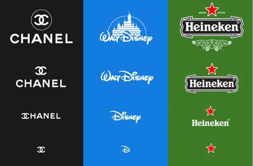
A responsive logo is a logo that adjusts in size, complexity, and layout depending on where it appears. Instead of using a single static design, brands create multiple variations of their logo that work across different devices and platforms.
For example, a brand’s full logo might be used on a website’s desktop version, while a simplified or icon-only version might appear in a mobile app or as a social media profile picture.
Why Brands Need Responsive Logos
1. Digital-First Branding
With brands being discovered primarily online, logos must be optimized for websites, mobile apps, social media, and even smartwatches. A logo that looks great on a billboard may not be effective in a tiny app icon.
2. Mobile & App Optimization
Over 60% of web traffic comes from mobile devices. A complex, detailed logo can lose clarity on small screens. Responsive logos ensure that branding remains clear and recognizable, whether displayed in a browser tab, a navigation bar, or a mobile app icon.
3. Social Media Versatility
Each social media platform has different image size requirements for profile pictures, posts, and banners. A full-width logo may work on a Facebook cover photo but not as an Instagram profile picture. Having multiple logo variations ensures consistency across platforms.
4. Better User Experience & Brand Recognition
A simplified logo at smaller sizes ensures faster recognition. Consumers interact with brands in different ways—on mobile, desktops, packaging, ads, and more. A responsive logo ensures a smooth experience, reinforcing brand familiarity across all touchpoints.
Examples of Brands Using Responsive Logos
Many top brands have embraced responsive logo design:
- Google: Uses a full-wordmark logo but switches to the ‘G’ icon for smaller applications.
- Nike: Often uses the full ‘Nike’ wordmark but relies solely on the Swoosh for simplified branding.
- Coca-Cola: Maintains its classic script logo but adapts it for digital, mobile, and even minimalist outlines.
- Chanel: The interlocking CC monogram works well on product packaging, social media, and app icons.
How to Create a Responsive Logo for Your Brand
- Design Logo Variations – Have multiple versions:
- Primary Logo (Full detail for large screens and print)
- Simplified Logo (Less detail for smaller screens)
- Icon or Symbol (For social media avatars, favicons, apps)
- Monochrome Version (For different backgrounds and print uses)
- Maintain Brand Consistency – Even with different logo variations, ensure they share the same color palette, font, and style to maintain brand recognition.
- Test Across Different Platforms – Check how your logo looks on websites, mobile apps, social media, packaging, and merchandise.
- Keep Scalability in Mind – Your logo should look sharp and recognizable whether it’s on a business card or a giant billboard.
Final Thoughts
A responsive logo is no longer a luxury—it’s a necessity for modern brands. By adapting to different platforms and screen sizes, businesses can maintain strong, effective branding across all digital and physical touchpoints. Investing in a responsive logo ensures your brand remains relevant, versatile, and recognizable in an ever-changing digital world.